

Is Website Navigation Optimization a Serious Thing?
Table of Contents
Website Navigation optimization helps you organize your site. It can be frustrating to visit a website and not find what you are looking for, even as little but important as contact details. One of key characteristics a user-friendly website is easy navigation. The easier your website navigation is, the more time visitors will spend on your site. Read on to find out how to optimize your website navigation and give your visitors the best experience.
What is website navigation optimization?
Website navigation optimization is the process of improving how visitors and search engines access information within a website. This process includes page structure, menu labelling on mobile, tablet and desktop and the website’s taxonomy.
According to analyst Nathaniel Davis, “website navigation is the very tip of your site’s information architecture (IA) iceberg. Beneath the water is the massive part of the iceberg that no one sees: research, strategy, management, classification schemes, and more.”
Types of Website Navigation Structure
Before we dive into the tips for website navigation optimization, let’s take a concise look at the different types of website navigation. In this section we will discuss the general types of website navigation, you may need to stick to all or leave out some depending on whether your website is ecommerce or not.
Horizontal Navigation Bar
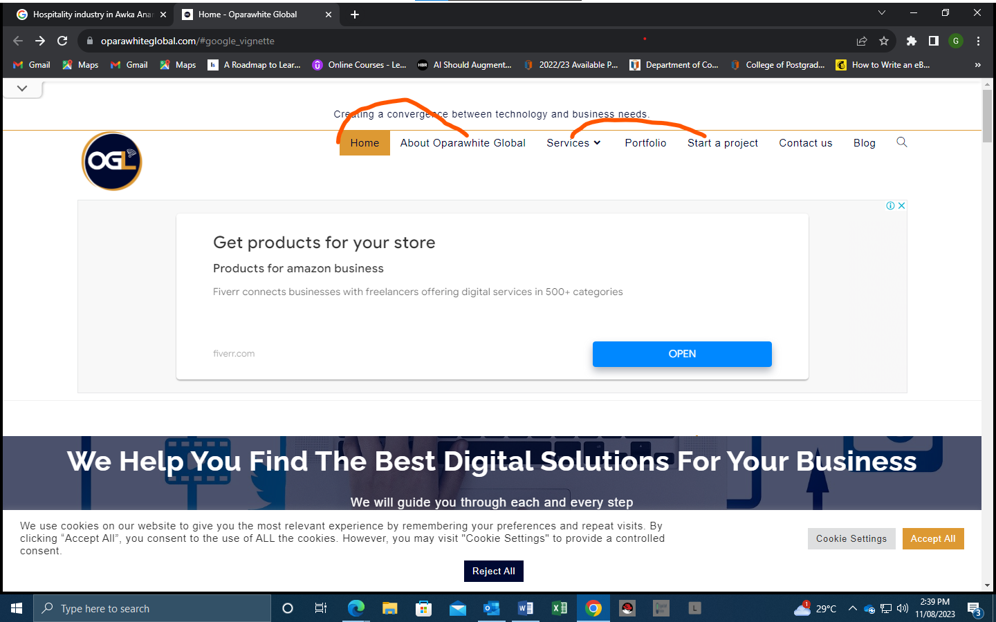
The most common type of website navigation is the header navigation bar or simply the header. Usually, the header include the website’s most important pages; the pages you know visitors will need early access to.
These top-level links displayed as various consigned pages are displayed side-by-side, horizontally, in the header.
Dropdown Navigation Menu
Dropdown menus are tiers of navigation used in arranging content (pages) or products in layers so that your website does not look cumbersome. Typically, the main page or most important links are used as top-level navigation so that when a user clicks or hovers over a link, a menu expands with more links. There could be a number of layers of dropdown menus.
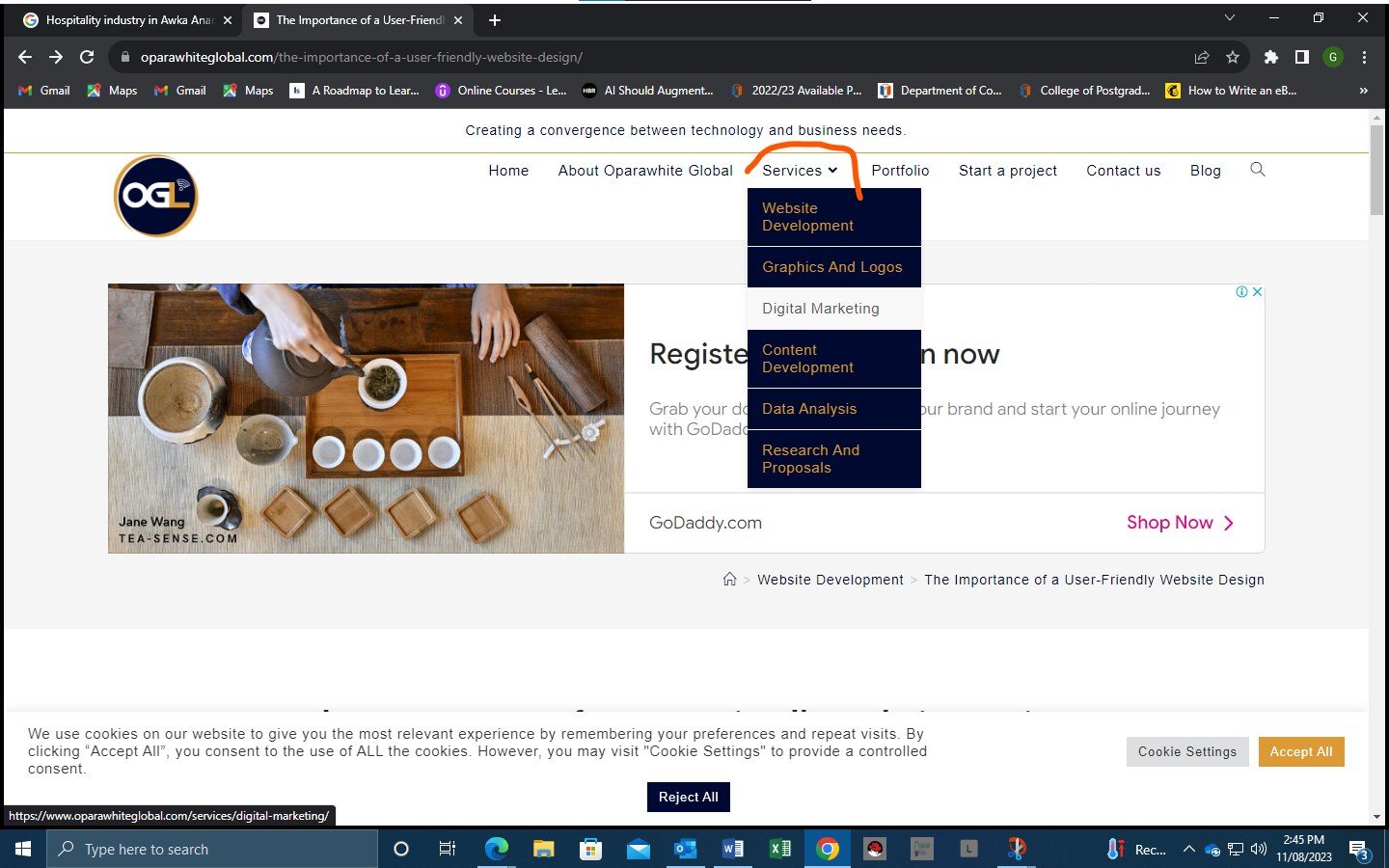
Dropdown menu is best for websites that are rich in content as it prevents your website from looking disordered and gives users enough and clear paths to find their desired content or products.
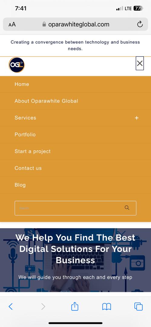
Hamburger Navigation Menu
Hamburger navigation menu is simply that three dots or lines you see on the top right or left side when you open a website or app on your mobile phone. Instead of listing your sites pages and any of the top-level links on the page, everything is hidden behind the button. Clicking or simply tapping the icon reveals the menu. Clicking the page opens the page’s content. While tapping a menu expands the menu further, revealing additional pages or options.

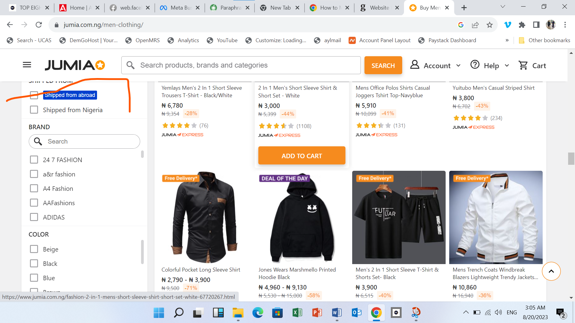
Vertical Sidebar Navigation Menu
A vertical sidebar menu is a list of links piled on top of each other, positioned on either side of the page. This navigation menu is usually better for websites that have too much menu for a horizontal menu such as a news site, content-rich blog, online store or e-commerce website.
Footer Navigation Menu
The footer navigation menu as the name implies is found on the bottom part of the website. It is usually the spot where you have the summary of your site in various links. Typically, it contains links to most pages and posts list or dropdown on the site (For ecommerce websites, product pages are not usually included).
WEBSITE NAVIGATION OPTIMIZATION TIPS
1. Fewer Top-Level Navigation Links
If your website has a lot of pages, you don’t have to add all of them to your navigation menu. First, choose the pages that will be in your primary menu, how many will be in your secondary menu, and footer menu. Create a dropdown for pages with layers. Now allot the menus to their respective navigation; the primary header, sidebar navigation and footer menu.
It is important to note that fewer items in your website navigation is good for your search engine optimization.
2. Strategic Arrangement of Your Navigation Menu
To take users or visitors to your site’s most important links, place them at the beginning and end of your menu. For instance, in the case of an e-commerce website that is running a promo, flash or clearance, it would make smart to put a link to your “clearance, promo or flash sale” category as the first navigation link.
3. Responsive Mobile Website Navigation
If your mobile menus lack order or visual hierarchy, visitors will most likely find it difficult to decide where to go next. Having a mobile-responsive navigation menu is critical in providing direction to visitors and driving engagement which increases the amount of time your visitors spend on your site.
4. Responsive Navigation
Ensure your website’s navigation is responsive to desktop, pc and tablets. This is to ensure that your site does not leave visitors juggling between menus or links to find their desired information.
5. Provide Clues for Your Users
Provide clues to help visitors to easily find the right page. This include clues within your drop-down menu. A clue could be a menu title or header, an icon, or any other helpful piece of information.
6. Fashion Separate Website Navigation Menus for Diverse Audiences
It’s always complicated to design an interface that caters to the needs of two parallel groups. To ensure each group can find what they need — without having to scramble through irrelevant content — create two menus that cater to their respective needs.
For instance if your website serves both job seekers and job hirers, it would make sense to create two distinct menus that contain links to the information required by those seeking jobs and those looking for people to hire. Same goes for an online market that caters for those seeking to sale and those seeking to buy.
7. Design an All-inclusive but Concise Footer
Your site’s footer should provide navigation links to all the important pages (including your blog section) on your site, so that visitors can quickly find the link to what they are looking for.
8. Strategic Placement of Your Social Media Handle Icons
You don’t want to add your social media icons on your site’s header. It can be ignored and forgotten by users or I would distract users from what brought them to your site originally. Your footer is the most sensible place to place your social media icons. If your site’s colors are visually appealing you can use icons, but if not consider using a text link to your social media handles.
9. Tactical Display of Call to Action Buttons
Don’t leave your visitors wondering what to do after going through the nice content on your website. Don’t leave them searching for that important buttons such as donate, shop, make payments, contact, pick item, and learn more buttons.
10. Well-Placed Search Feature
Place your search icon or button strategically at the header and footer parts of your websites. Depending on the kind of website and the preferred choice of side bar menu, you can also place it either on the left or right side of your site’s sidebar navigation menu. Spice up the visual by mixing both search icon and search button.
What Next?
Now that you have learned different types of website navigation optimization, take a critical look at your website and see if its navigation is optimized. If it is, great! Congratulations, you are on track. But if it is not rejig that website now. Contact us if you need professional assistance…

